A new supply chain data management and submission experience
Fair Trade USA is the leading certifier and labeler of fair trade products in North America. Businesses that buy/sell Fair Trade Certified™ goods are required to report their transactions to Fair Trade USA. Users were frustrated with the old transaction reporting experience, relying on high-touch support from Fair Trade USA.
The goal of this project was to reduce cost to serve and increase on-time reports.
ROLE
UX Designer @ Fair Trade USA
Led user research, interaction and visual design, and usability testing
TEAM
1 designer, 1 product owner, 2 full-stack engineers, and 1 QA tester
50%
Time saved on support tickets per week
+90%
On-time reports per quarter
50%
Time saved cleaning data per week
Qualitative Interviews
I conducted user interviews with 15 customers, with the goal of understanding their data management practices and past experience reporting transactions to Fair Trade USA.
Key Participants
Personas
Journey Map
Mapping the as-is process and user grievances to identify opportunities for improvement.
Scenario: A Certification Manager at a large food and beverage brand reports transaction data.
Key Learnings
Users often forget what they need to do between quarterly reporting periods.
There is very little consistency across companies’ data systems and field labels. Users are unsure if they are providing the correct data points.
Users’ number of quarterly transactions vary wildly, from 1 to 10,000+ records.
Exploring Solutions
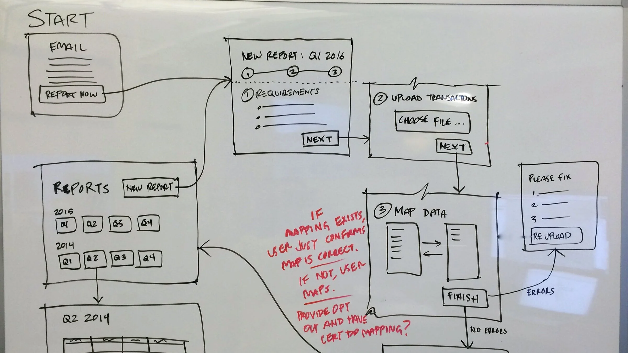
Users report once per quarter, so they tend to forget what to do. I explored user flows and interaction patterns for a more guided experience. Form Design for Complex Applications was a helpful article in the process.
Exploring concepts for PM and engineer feedback
Finalizing to-be user flows
Wireframes
Non-UI Solutions
By collaborating with engineers early in the process, we were able to solve some problems outside the UI, which resulted in a simpler UX.
Problem: Users’ quarterly transaction volume varies wildly, from 1 to 10,000 or more records.
Solution: Default the user to the easiest reporting method for their volume — webform or bulk upload.
Problem: Users are unsure if they are providing the right data.
Solution: Create custom field labels that match the user’s database, removing guess work.
Final Design
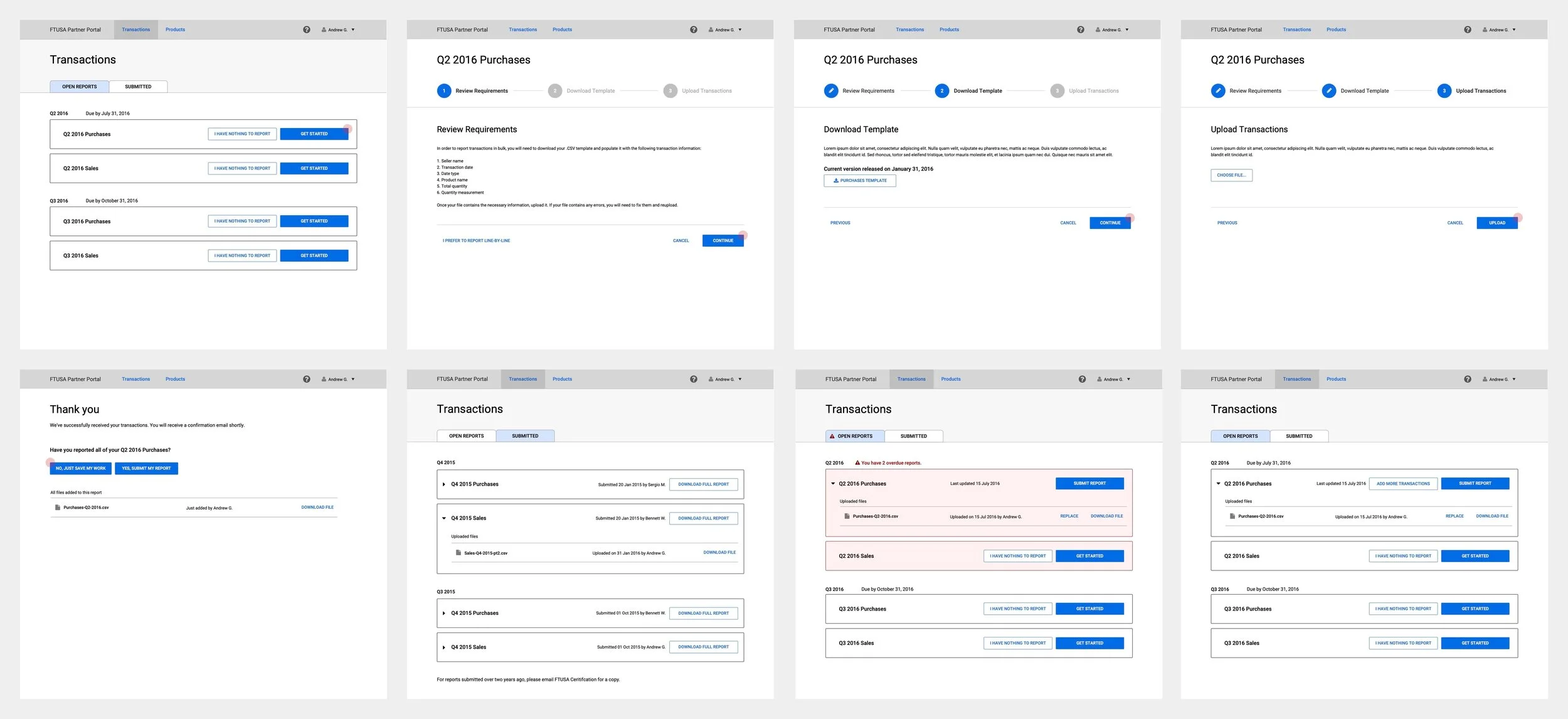
Users default to the most efficient reporting method, based on their transaction volume. Those with over 20 transactions to report are guided through an upload process.
Usability Testing
I led remote usability testing with six customers. The goal was to understand what is and isn’t working in the report upload workflow.
Takeaways
Testers understand a stepper/wizard. We were able to remove an up-front instructional page.
Testers biggest struggle is receiving and correcting errors on their CSV upload. We improved error message copy and redesigned the error page.


